Design of Everyday Things - Overview
As a whole, I thought this book was
very engaging and kind of made me think more about how things are
designed. Before reading this book, I just never noticed or payed
attention to why my stove has a knob on one side that controls a
burner on the other side or how I know whether to push on the
right/left side of door. The other day, I caught myself pulling open
the doors in the back of the Bright building without giving it any
previous thought. According to this book, it's because it's a well
designed door. One of my favorite parts of the book was when the
author started talking about whether there is a psychology of
materials. It was really interesting how people react differently to
materials; when there was glass vandals would break it and when there
was plywood they would tag it up. It makes me try to think about what
went on in their brain when they saw the glass was no longer there.
Why would they choose graffiti over smashing/destroying the wood?
They knew they wanted to destroy something the material influenced
their choice of destruction. It's like when people slash tires, is it
because it causes the most damage? Or is it because tires afford
slashing/deflating?
Another
part of the book, that I really liked, was the freudian slips section
(Chapter 5). It was interesting because it applies to everyone.
Everyone has slipped up before. One funny slip that happened to a
friend of mine, a while back, was him trying to say “I don't like
boys, I like girls!” but he got ahead of himself and said, “I
don't like girls!”. Now me and my other friends always make fun of
him about it. Anyway, the chapter just made me think about the way
human minds function and how complex they are. I know sometimes I run
up to my room to grab something and forget what I wanted to grab. I
can't remember until I finally go down the stairs, then it hits me
and I have to run all the way back up to my room. It even happened to
me today in the morning! I pulled out my phone to see if the bus was
near my apartment (they have GPS now so you where they are in
real-time, in case you didn't know). I looked at my phone for a good
30 seconds trying to remember what it was I wanted to do. I couldn't
remember so I put my phone back in my pocket and as soon as I looked
up at the door handle, I remember why I had pulled out my phone in
the first place. I guess the handle reminded me that I was going
outside to wait for the bus and the thought of the bus made me
remember that I wanted to check where the bus was at.
Mapping was another aspect of design
that the book made me notice. I never knew/realized that a lot of
things I use have natural mappings. There are some things that don't,
but most of the objects I use have natural mappings. I also noticed
that natural mappings are extremely helpful. One time I was playing
Halo with the look inversion (push down to look up and push up to
look down) and I was having a really hard time trying to follow other
players across the map. Pushing up to look down was just so unnatural
that I couldn't follow through with it during the game. And when
natural mappings aren't possible, I do agree with the author that
standardization would be really helpful. Whenever I switch from
playing Halo to Call of Duty, or vice versa, I always have a hard
time because I get used to the controls in one of the games and it
causes me to do something I don't want to in the other. If all games
of the same genre had the same controls it would be WAY easier, but
the standardization of games won't happen any time soon; probably not
ever.
This book made me think about how much
thought and effort goes into designing things so that they are used
properly by the user. However, one thing that I noticed was that the
author had too many experiences with bad designs. Maybe, the designs
of everyday objects has improved tremendously since the book was
written or the author and his friends were just unlucky. I've had bad
experiences with doors, like I'll push on the right side when I
should push on the left, but I've never gotten stuck between sets of
doors. That seems like you would have to try really hard to be
trapped between doors. Maybe it was just that designs, at the time,
were REALLY bad. Overall, it is one of the more interesting assigned
readings I've had.
Chapter 1: The Psychopathology of Everyday Things
I
hate reading, but so far the book is somewhat interesting. I never
really thought about why I decide to push/pull a door open. After
reading this chapter, I realized how placing a handle/bar closer to one
side of a door can subconsciously influence a person to push/pull in
that direction. At my house, there are couple of clusters of switches in
the kitchen, living room, and hallway, and although I have been living
there for almost 6 years, I still have to push every switch to get the
right set of lights to turn on. It gets frustrating, having to cycle
through several switches to turn the right lights on. I have also
realized that the design of a product is not simply thrown together. It
is a careful, time-consuming process that is necessary to make sure an
object has the ability to be used in the right way. I will probably
trying to spot all kinds of bad designs, after reading this chapter.
Chapter 2: The Psychology Of Everyday Actions
This
chapter was interesting and made me really notice how often people
blame themselves for not being able to properly use something. The other
day, after the Thursday night Bears-Packers game, one of my friends was
trying to put away a foldable table. Setting it up was really easy, and
so was putting it away if you had read the instructions or had done it
before. However, this friend of mine had never dealt with this kind of
table before and was having trouble folding it up. It was fun watching
him struggle so I didn't tell him, until several minutes later, that
there was a small latch that needed to be pushed down while folding the
table. After he finally got the table folded up, he said "My bad, dude."
It was not until I read this chapter that I noticed he blamed himself
for not being able to operate such a simple table. The culprit was the
latch which was small, hidden, and the same color as all the other metal
parts of the table, yet he blamed himself. There are plenty of other
times that I've experienced similar scenarios, but never really payed
attention to how people blamed themselves for poor designs. I also
thought the way people think about thermostats and how they work in this
chapter was interesting. I used to turn the stove on high to boil water
faster, then turn it down once the water began boiling. My thinking was
the heating coils would stay on longer if I turned it on high, which
would result in a quicker heat up. I guess I was wrong!
Chapter 3: Knowledge In The Head And In The World
The
intro to the chapter was funny because this summer something similar
happened to me when my uncle let me borrow his car. He asked me to move
his car out of the driveway and park it near the curb. It was night time
and it was a car I wasn't familiar with, so when I finished moving it
and tried to take the keys out of the ignition, they didn't want to come
out. I was outside trying to pull them out of the ignition for about 10
minutes and I didn't want to go inside and ask my uncle how to take
them out because I would have felt dumb (maybe bad design?). I turned
the steering wheel all the way in one direction and tried to take them
out (works on MY car) but they were still stuck. Finally, I found a
little button nearby, not labeled in any way, that needed to be pressed
while taking the keys out. I though that was a real stupid way to have
to take out keys, but it might have just been me being mad at spending
10 minutes outside for a simple task.
I also liked the
penny experiment. I had seen the experiment before and guessed the wrong
penny and then figured out what the right answer was. Yet, my past
experience with this experiment still did not help me guess the correct
penny, this time. Like the book says, I guess I know how to use a penny,
but it is so meaningless (worthless) in my life that I cannot
distinguish the correct penny from a variation of pennies.
The
remembering to remember section was another section of this chapter
that I found interesting. Many people say they will remind themselves of
certain things they need to do, but how are they going to remind
themselves to remind themselves? I thought that was pretty funny, yet
true.
Chapter 4: Knowing What To Do
I
recently took an aerospace class and we talked about making cockpit
controls have similar features/appearances so that they could be
associated with the specific function, rather than having two similar
looking controls and pushing one when you meant to push the other. We
discussed making the control for the landing gear like a T-handle with
wheels on either side to simulate a landing gear appearance. We also
talked about making controls that looked like flaps for the flaps of the
airplane. Pretty much the same scenario the book talked about, we
talked about in that class.
The part of eliminating
feedback, like sound and visuals, to make the design more appealing is
good to a certain extent. Sometimes I like to hear the sound of
something on/running or I like to see that something is there. I like a
confirmation that something is working/running, but if we start trying
to eliminate all the "negative" feedback, some people are going to be
confused as to whether the object is doing what they want it to. The fan
in my room makes a lot of noise, but when I go to sleep I like to hear
some noise so I sleep with it on all the time, even if it's freezing.
Chapter 5: To Err Is Human
So far, I
like this chapter the best because the slips are something that I, and a
lot of other people, can relate to. There was one part in this chapter
that talked about leaving your card at an atm machine after taking your
money; I haven't done that before but it reminded me of when I would
play zombies on Call of Duty and go to upgrade my weapon. After I would
put it in the upgrade machine, I would run to check for zombies nearby
and several times I forgot about going back to pick up my weapon, and by
the time I remembered it had disappeared. My family and I recently
moved and I've noticed that sometimes my mom would be half way to our
old house before she realized that she was going to the wrong place.
The
dealing with error and forcing functions section was very interesting,
too. I hate that a chime goes off whenever I don't have my seatbelt, yet
I don't wear my seatbelt still. It's uncomfortable and the risk of a
crash is low. Typing about this right now makes me think that I should
wear it all the time because it's better to be safe than sorry, but as
soon as I get in my car my mind changes. I do agree that forcing someone
to do an action usually results in them trying to rebel. I don't think
there is much you can do to force someone to do something when they
really do not want to do it.
Chapter 6: The Design Challenge
Designing
products so that all users can use it perfectly is impossible. Even
trying to design a product so that 95% of users can use it without
difficulty is hard. I think that the amount of experience with a product
and whether it was around in your time period has a lot to do with the
product's usability. I have a lot of computer science teachers that can
barely work a computer for regular tasks, but can code up the most
complex projects with ease. This is kind of frustrating to me because
they have there Ph.D. and work with computers all the time, yet they
don't know how to search for a file when they can't find it on the
desktop. That's why I say the period in which it was released matters. I
think checking e-mail is a very simple task, but it might be because
I've been doing it for a long time. However, my mom has a really hard
time checking her e-mail. She thinks that once she types her username
into the address bar, her e-mail will magically appear. She works with a
computer everyday at work and she still can't get to her e-mail without
calling me to walk her through the process. I believe it's because she
never had e-mail when she was younger (ideal for learning) and she
really has no need for it. I agree that design does play a big role in
usability, but I also think the frequency of use and the age at which
you begin to learn it, both, play major roles.
Chapter 7: User-Centered Design
I
thought the cartoon at the beginning of the chapter pretty much summed
it up. There are many products out there that have the potential to be
extremely useful/helpful, but the way are designed takes away from
actual usability. Many designers (raccoons) model products after how
they would use them rather than taking into consideration the users
needs (horses). It's pretty much like a math/physics class at A&M.
The math and physics professors teach their course as if all the
students in the class are experts. They might teach it like that on
purpose, but some students have never talked about some of the difficult
concepts before and are expected to know them as soon as they walk in
the door. Also, they either do the hardest example possible to where it
is impossible to figure out how to even approach any type of problem or
they give a super easy example to where a single step is needed to solve
it and then they give an impossible question on the midterm. They
aren't designing their teaching for the students (user) but for people
with knowledge, equal to theirs, of the topic. Another example is chairs
inside of trailers. The manufacturing companies of trailers place seats
that they feel are comfortable. However, my dad and his friends, who
all drive trailers, are always complaining about how uncomfortable the
chairs are, how the arm rests crappy, etc. The manufacturing companies
design the trailer on what they feel would be comfortable, based on
sitting in a chair for probably 5 minutes. However, they probably didn't
take into account that truck drivers sit down in that chair almost ALL
day. User-centered design is very important.
5 Examples of Good Designs:
 |
| This is a picture of the window controls for my car. The button on the far right in the middle of the picture is one of the window controls and the other is on the opposite side but kind of hidden in shadow. This is a good window control design because they are arranged where the button on the left controls the driver window (left) and the button on the right controls the passenger window. Also, you push the lower part of the buttons to lower the windows or the upper part of the buttons to raise the windows. It's a natural mapping. |
 |
| This is the AC vent on the passenger side of my car. This is a good design because it has natural mappings for the controls. The user slides the slider (it's hard to see but it's that thing near the bottom of the vent) to the left, right, up, or down, depending on where they want to focus the air. The dial on the left is used to control air flow. Roll up to release more air and roll down to constrict air flow. If the user can't figure it out just by looking, there are markers and labels so they can figure it out. Slide the white marker closer to the On or Off labels for the desired effect. |
 |
This a picture of the mirror control for my car. It is the black knob on the bottom left corner of the picture. It is a good design because the way you move the knob, that's the way the mirror moves. There is a slight rotation needed, I guess, but when you're in the driver's seat the mirror movement follows the way you move the knob. You move the knob up or down to move the mirror up or down, and move the knob left or right to move the mirror left or right. The control, also, has a natural mapping.
|
 |
| This is a picture of the volume controls for most, if not all, phones. It has a natural mapping and is really simple. Push the up button to raise the volume and push the down button to lower the volume. Of course, the user has to know what those buttons are for in the first place, but if you buy a smart phone you have to know what those buttons do. I think its a good design. |
 |
| This is a picture of an Xbox 360 controller. It uses a joystick to move. Your character moves in the same direction as the joystick in this game. It's a natural mapping because what you think is what it does. In other games, another joystick is required to rotate your character but it is still a natural mapping because the character rotates in the direction that you move the other joystick. Pretty simple, yet good design. |
5 Examples of Bad Designs:
 |
| This is a button on an LED flashlight that my dad gave me. It has two sets of LEDs. The button is supposed to control both, but it only gives I or II to distinguish between the two sets of LEDs. After guessing you can figure it out, but the I and the II do not relate to the sets of LEDs in any distinguishable way. I still sometimes light up the wrong set of LEDs, instead of the set that I intended. |
 |
| These are the light switches that control the upstairs, outside, and downstairs lighting in my apartment. If you were to walk up the these in my apartment, you would assume the leftmost switch is for downstairs, the middle for outside, and the rightmost for upstairs because that is the way my apartment is mapped. However, they are wired to the opposite of that with the leftmost for upstairs, middle for outside, and rightmost for downstairs. I've been living at this apartment for almost 2 years and I still have trouble turning on the light I want to the first time. I turn on the downstairs lights when I mean to turn on the upstairs lights and vice versa. It's too confusing of a design, although I think the person who wired it like that just messed up. |
 |
| This is the thermostat at my apartment. If you can't see from the picture, it has 3 modes: Cool, Off, Heat. It also has two sets of temperature gauges. I've already gotten used to this, so I know which temperature gauge controls heating and which controls cooling. But, if you were to guess you would probably say the top is for heating, since Heat mode would require moving the lever to the top, and cooling is on the bottom, since the lever would need to be moved to the bottom. It is actually the opposite. The cooling temperature gauge is the top one and the heating gauge is the bottom. This is another confusing design because it makes you think the opposite of what it actually does. |
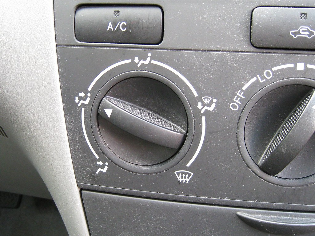 |
| This is the air flow control of a Toyota Corolla. If you want air to blow only on your feet, you point the arrow on the dial straight up. If you want it to blow towards your face only, you point the dial arrow mostly down and to the left. This is a bad/confusing design because naturally down is towards your feet and up is towards your head/face. The car designers could have been mapped this air flow control to the human body where air flow towards the face is near the top and air towards the feet is at the bottom. It would make things a lot easier, especially if you have your eyes on the road. |
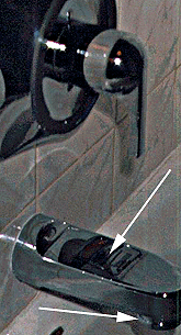 |
| This is a type of shower faucet I came across when I was at my cousin's house one time. The first arrow is pointing towards a sticker that tells you how to make water come out of the shower head. Unfortunately, when I was at my cousin's house, everyone was asleep and the sticker was no longer there. I probably spent 2-3 minutes trying to figure out how to make water come out of the shower head. Most shower faucets have a little pin you pull on to do this but not this one. It was pretty difficult to find and I got lucky because I just started to messing with every thing on the faucet/shower control. The second arrow points to the part where the water comes out of the faucet. It turns out you have to pull that down to make water come out of the shower head. It was pretty annoying and, to me, a bad design. It might be one of the worst faucets I've ever come across. |


